
How to read the “Contests” dashboard
Who can view the “Contests” dashboard?
Admins and Devs can view the “Contests” dashboard.
Where can I find the “Contests” dashboard?
The “Contests” dashboard is found in the back office.
Select a Universe with the “Contest” feature enabled from the “Manage” menu.
Click “Contests” in the Universe menu. You will land on the “Contests” dashboard.
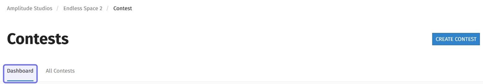
The “Contests” page header is shown above. The “Dashboard” tab is highlighted in purple.
What can I see on the “Contests” dashboard?
The “Contests” dashboard displays data for all of a Universe’s contests over time. You can view statistics for a specific contest on that contest’s back office page.
At the top of the dashboard is the “Contests Insights” graph. Two further boxes display the top contest and the top proposition based on a specified metric over a selected period of time. The fourth box sorts propositions on a specific metric over a selected period of time.
Note: Clicking on a contest or proposition will open that content on the front end.
“Contests Insights” graph
The “Contests Insights” graph shows the number of upvotes, views, and comments on all contests over a range of time. The graph key at the bottom identifies each metric by color.
You can set the time range the graph displays using the “Start Date” and “End Date” fields in the top right of the graph.
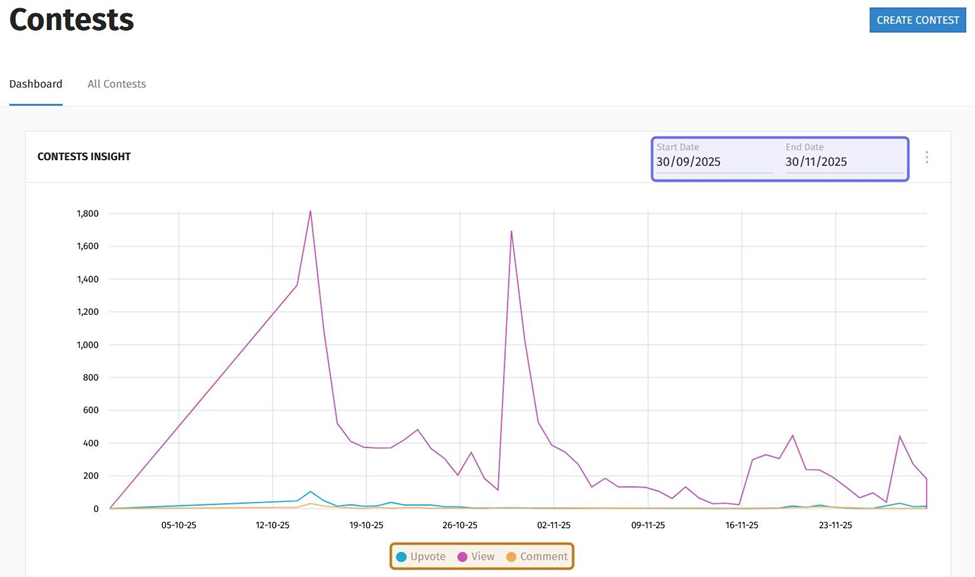
The “Contests Insight” graph at the top of the back office “Contests” page is shown above. The date fields are highlighted in purple. The graph key is highlighted in yellow.
To specify a time range, click on the “Start Date” field. A date picker will open. Click on the earliest date that you want the graph to display.
Then, click the “End Date” field and select the latest date that you want the graph to display. The graph will update as you enter new dates.
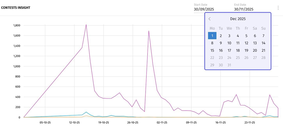
A date picker is highlighted in purple above.
Note: You can export the graph data by clicking on the three vertical dots in the top-right of “Contests Insight.”
Top Proposition
The “Most Upvoted Proposition” block shows the top proposition by upvotes in the past month by default. The block names the proposition and includes the date posted and author’s username. Clicking on the proposition title will take you to the post on the front end. Below the title, date, and username is a summary of the proposition’s engagement metrics.
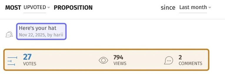
An example of a “Most Upvoted Proposition” block is shown above. The top proposition’s title, date, and author username is highlighted in purple. The summary of engagement metrics is highlighted in yellow.
You can change the metric and time range using the dropdowns at the top of the block. Click the time range listed on the right to open a dropdown. Select a predefined range from the list. You can select “All times,” “Yesterday,” “Last week,” “Last month,” or “Last year.”
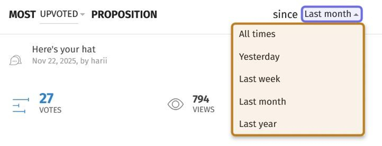
In the “Most Upvoted Proposition” block pictured above, the dropdown that lists time range options is highlighted in purple. The expanded time range dropdown is highlighted in yellow.
Click the dropdown in the top left to change the metric. You can choose to display the proposition with the most upvotes, the most views, or the most comments.
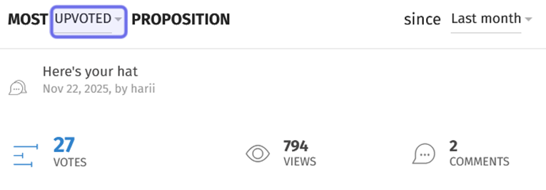
In the “Most Upvoted Proposition” block pictured above, the dropdown to change the metric used to determine the top proposition is highlighted in purple.
Top Contest
The “Most Proposed Contest” block shows the top contest by the number of propositions submitted in the past month. The block displays the contest title, contest date, and a quick summary of engagement metrics. Click on the contest title to view the contest on the front end.
You can change the metric and time range using the dropdowns at the top of the block. Click the time range listed on the right to open a dropdown. Select a predefined range from the list. You can select “All times,” “Yesterday,” “Last week,” “Last month,” or “Last year.”
Click the dropdown in the top left to change the metric. You can choose to display the contest with the most propositions submitted (“Proposed”) or the highest number of views (“Viewed”).
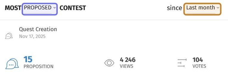
An example of a “Most Proposed Contest” block is shown above. The dropdown to select a new metric is highlighted in purple. The dropdown to select a new time range is highlighted in yellow.
“Most” and “Latest” Propositions
The “Most Commented Propositions” block is at the bottom of the page. This block sorts propositions submitted in the past month across all of the Universe’s contests by the number of comments on the proposition.
You can change the metric and the time scale using the dropdowns at the top of the block.
To change the time range, click the dropdown on the right-hand side of the block. Select a predefined range from the list. You can select “All times,” “Yesterday,” “Last week,” “Last month,” or “Last year.”
Click the dropdown to the left of “Propositions” to change the metric. You can sort propositions by the most comments, the most upvotes, or the most views.
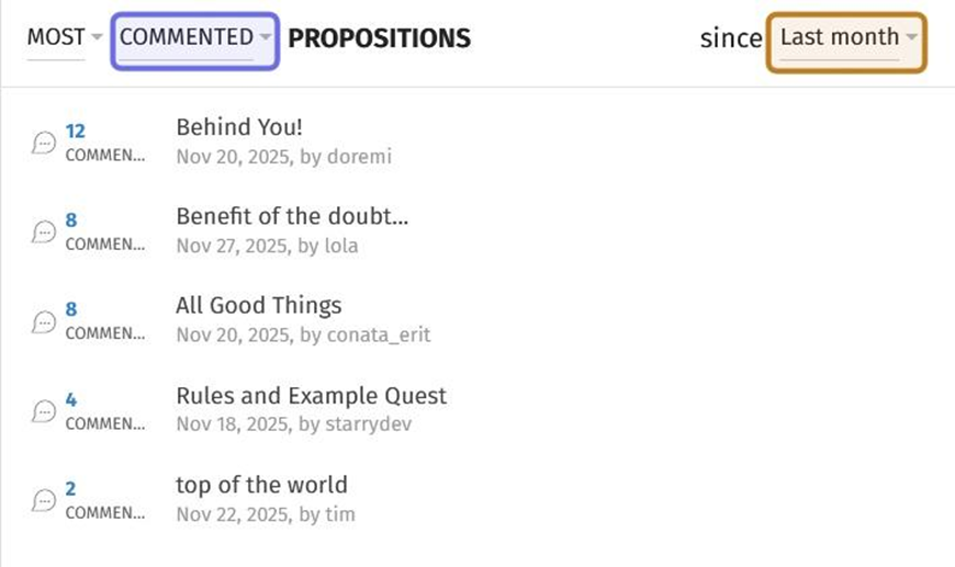
A “Most Commented Propositions” block is pictured above. The dropdown to change the metric is highlighted in purple. The dropdown to change the time range is highlighted in yellow.
This block can also list the most recently created propositions. To view recent propositions, click the dropdown on the left-hand side. This dropdown is set to “Most” by default.
Note: Click on a proposition title to be taken to the post on the front end.
Select “Latest” from the dropdown. The block will update to display an abridged list of the most recently submitted propositions across all of the Universe’s contests. When “Latest” is selected, you cannot select a new metric or time range.
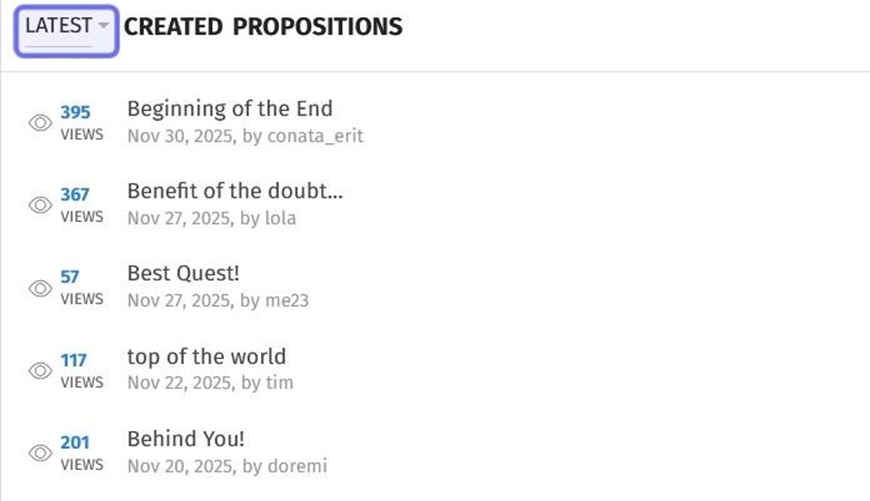
The above image shows the “Most Commented Propositions” block updated to show recently submitted propositions. The “Latest/Most” dropdown is highlighted in purple.