
How to customize the footer of the platform ?
What is a footer?
A footer caps off the bottom of a webpage. It is generally consistent across an entire site. Footers often include navigation and policy links as well as contact and copyright information.
Note: The very bottom of a G2G page will always include G2G copyright information.
On Games2gether (G2G), the footer contains links to the Studio’s Universes and recent news, an “About” section with site policies, the Studio’s socials, and two call-to-action buttons intended for newsletter sign-ups and a store link. Links to Universe features are also included when the user is on a Universe page.
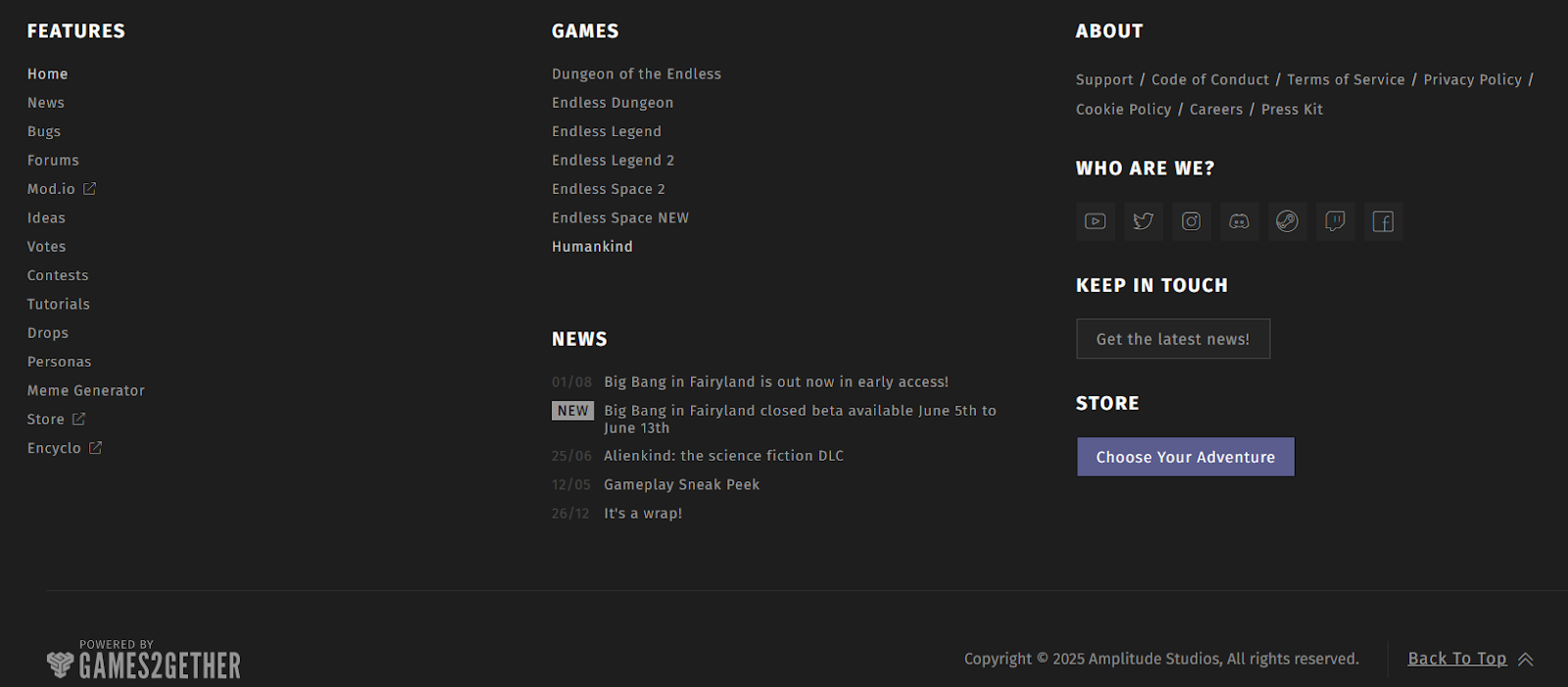
An example of a G2G footer on a front-end Universe page.
The exact contents of the G2G footer can be customized in the back office.
Who can customize the footer?
Admins and Devs can customize the platform’s footer in the back office.
Where do I customize the footer?
You can activate, deactivate, and customize the footer via the platform settings in the back office.
Scroll to the bottom of the “Manage” menu and click “Settings.” This will open a dropdown.
Select “Footer” from the dropdown. This will take you to the “Footer” settings page.
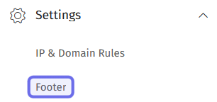
The “Settings” dropdown in the “Manage” menu is shown above.
The “Footer” option is highlighted in purple.
How do I customize the footer?
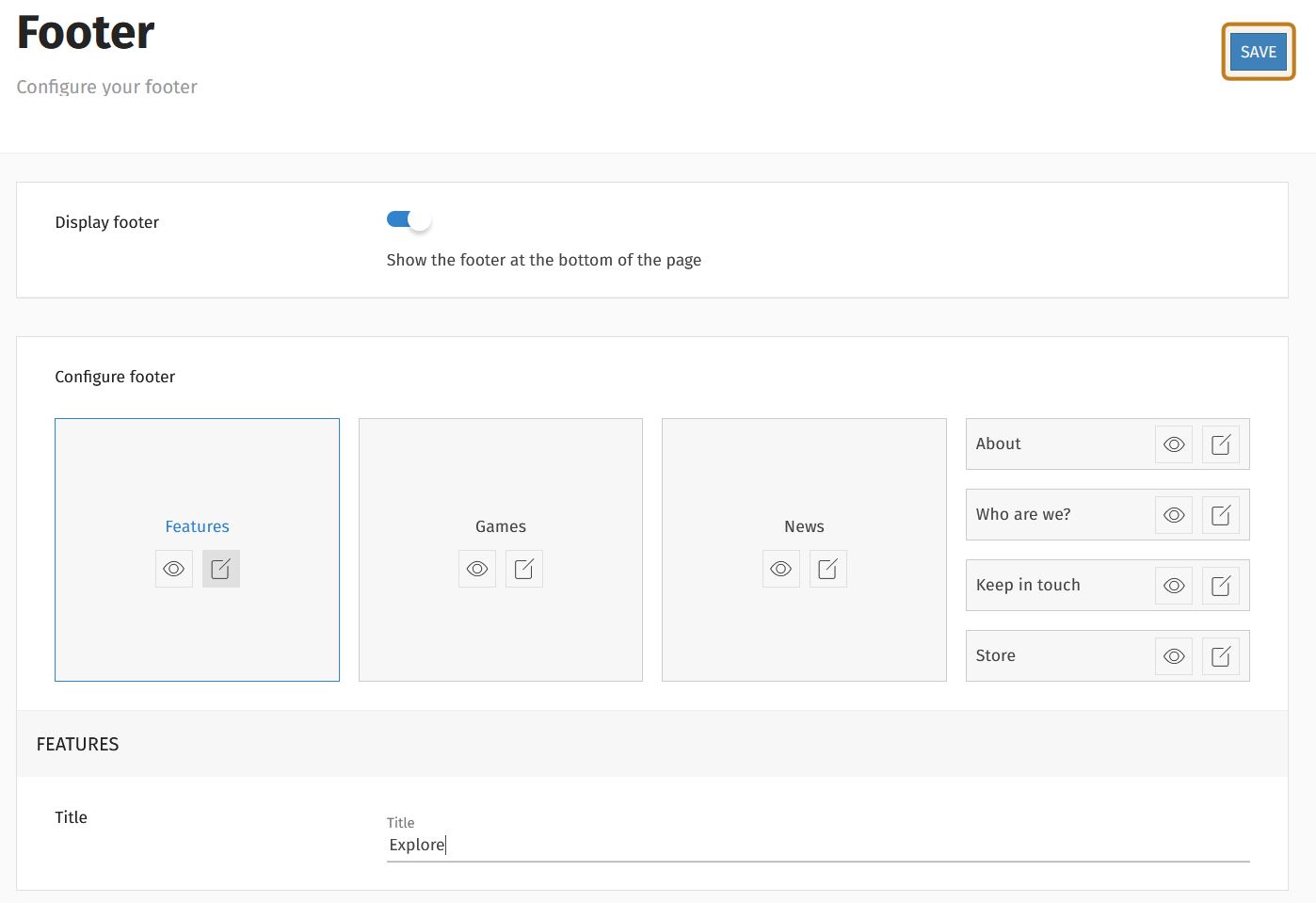
If you are setting up a footer for the first time, the “Footer” settings page will have a single deactivated toggle labeled “Display footer.”
Click to activate the toggle and add a footer to your instance of the G2G platform.
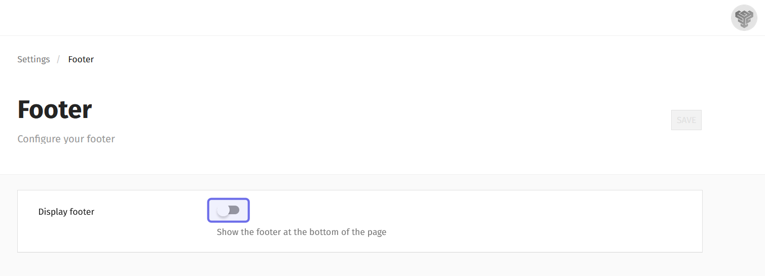
The “Footer” settings page with the footer deactivated is shown above.
The toggle to activate the footer is highlighted in purple.
Once “Display footer” is toggled on, a “Configure footer” section will appear. The “Configure footer” section contains all possible footer elements. Each element of the footer has a “Visible” button and an “Edit” button.
The “Visible” button is an eye icon that is either open or closed. It allows you to choose which elements you want to include in the footer.
If the eye is open, the element will be visible in the footer on the front end. If the eye is closed, the element will not be included in the footer.
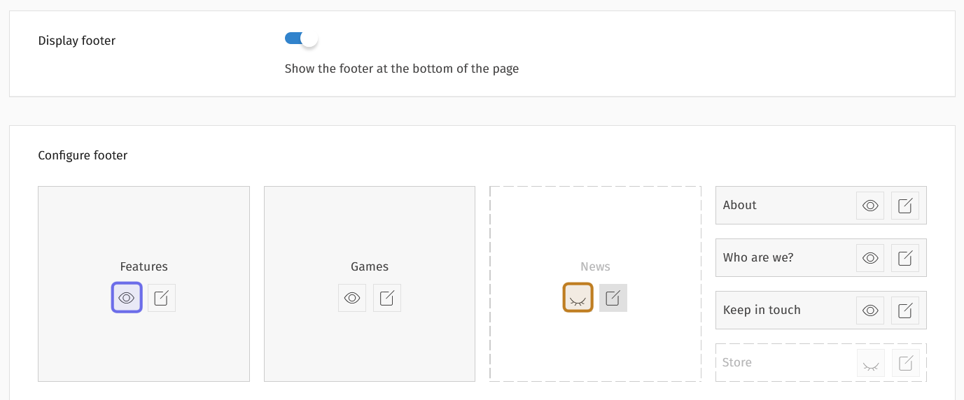
The “Configure footer” section is shown above. The “Visible” button highlighted in purple is active. The “Features” element is included in the footer. The “Visible” button highlighted in yellow is inactive. The “News” element is not included in the footer.
The “Edit” button looks like a square with a line through the top-right corner. When you click on an element’s “Edit” button, the customizable fields will appear below the “Configure footer” section.
The first three elements are arranged horizontally. On the right-hand side are a further four vertically arranged elements.
Features
You can change the title of the “Features” element by clicking on its “Edit” button. There are no other customizable fields for “Features.”
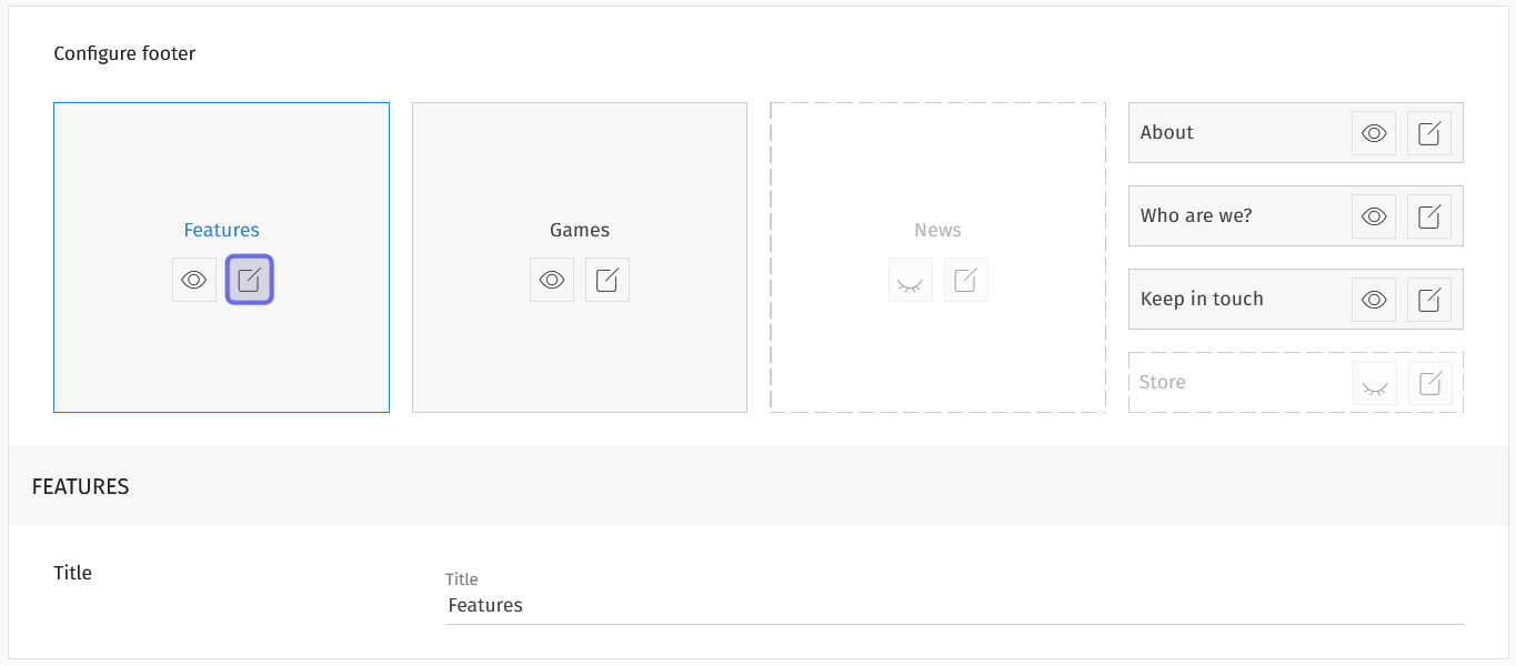
The “Edit” button for the “Features” element is highlighted in purple above. Below the “Configure footer” section is “Feature”’s customizable “Title” field.
The links displayed under “Features” are determined dynamically depending on which Universe the user is visiting. Any features activated for that Universe will be displayed. If the user is viewing the footer on a Studio Hub, the “Features” section will not be included.
Games
The “Games” element displays your Universes. Click the “Edit” button beneath “Games” to customize the element.
You can give the element a different title by replacing the text in the “Title” field. (This does not change how the element is identified in the back office.)
The “Sort by” dropdown determines the order Universes are displayed. The sort options are:
Followed: displayed followed universes in A-Z order, then the remaining Universes in A-Z order
Recommended/Legacy: displays Universes in the order specified in Settings
A-Z: displays Universes in alphabetical order
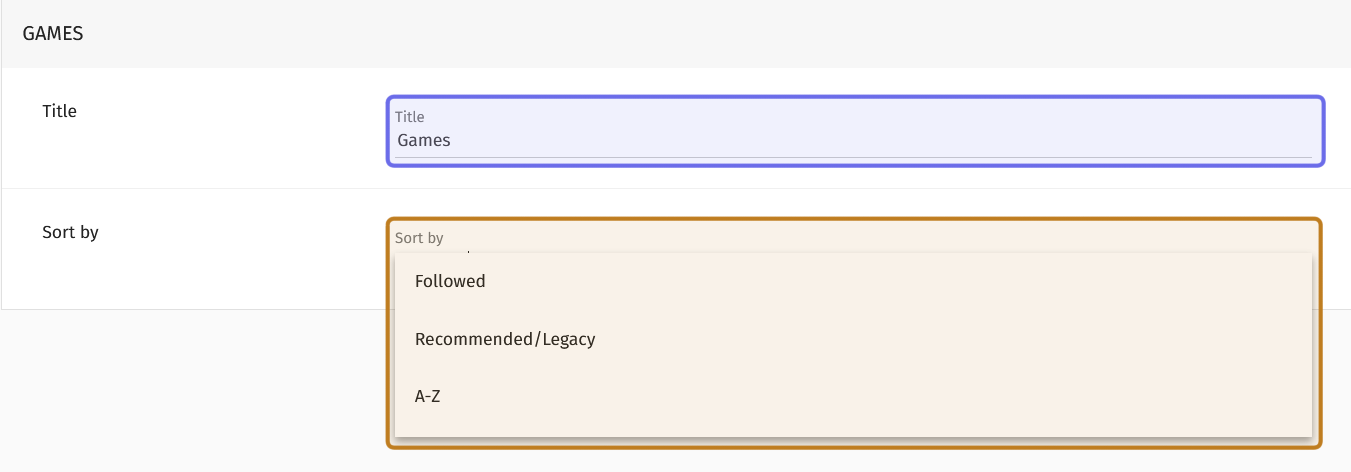
The customizable fields for the “Games” element is shown above. The “Title” field is highlighted in purple. The “Sort by” dropdown is expanded and highlighted in yellow.
News
The “News” element displays recent articles. Which articles are listed depends on where the user is viewing the footer and how you have indicated that they should be sorted. The “News” element will only show articles that would appear in that Universe or Studio’s “News” feature.
Click on the “Edit” button to customize. You can update the title by replacing the text in the “Title” field. (The element name in the back office will remain the same.)
The “Sort by” dropdown lets you specify how you would like the article titles to be ordered. Click on the dropdown to select from the following options:
Last published: displays recent articles vertically with the most recent at the top
Unread: displays recent articles vertically with articles a signed-in user has not read at the top
A-Z: displays recent articles vertically in alphabetical order based on the news article’s title
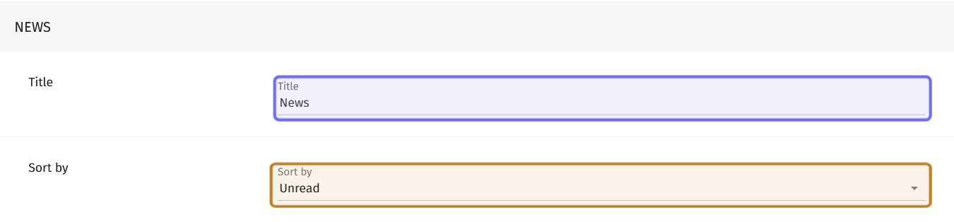
The customizable fields for the “News” element is shown above. The “Title” field is highlighted in purple. The “Sort by” dropdown is highlighted in yellow.
About
The “About” element allows you to add internal and external links. This is where you should include links to your support page, privacy policy, terms of service, and cookie policy. It is also a good place for links like “Code of Conduct,” “Team,” and “Careers.”
You can change the title or add a new link by clicking the element’s “Edit” button on the right.
To change the title, replace the text in the “Title” field. (The name of the element in the back office will remain the same.)
To add a new link, first click the “Add Link” button below the “Title” field.
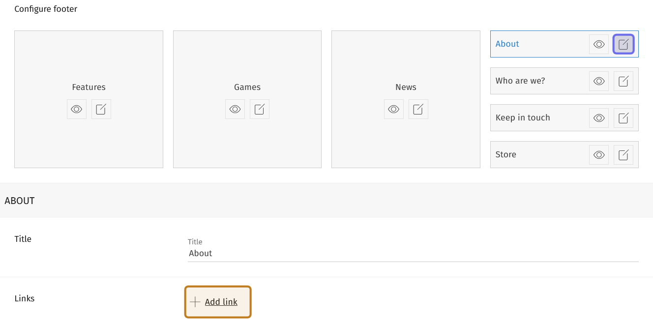
The “Configure footer” section and customizable “About” fields are shown above. The “Edit” button for the “About” element is highlighted in purple. The “Add link” button is highlighted in yellow.
A dropdown and two text fields will appear. Click the dropdown to indicate whether the link you are adding is an internal or external link. The internal link option looks like the common hyperlink icon of two connected links. The external link option looks like a square with an arrow pointing outside the square.
After selecting an option from the dropdown, enter how you want the link to be displayed in the footer in the “Link Title” text field. This is usually the page title, such as “About” and “Contact Us.”
Add the page URL in the field labeled “Url.”
Note: You can delete a link that you no longer need or that was added in error by clicking the trashcan icon to the right of the “Url” text field.
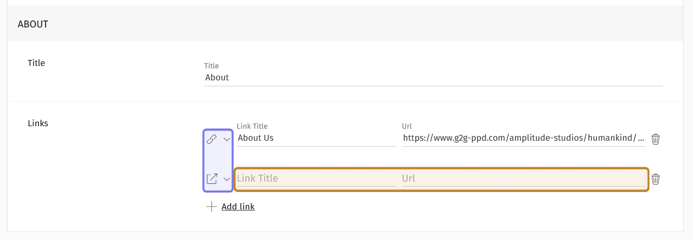
The customizable fields for the “About” section are shown above. Dropdowns to select the link type are highlighted in purple. An internal link is the top selection. An external link is the bottom selection. The “Link Title” and “Url” fields are highlighted in yellow.
On the front end, each link in the “About” element is separated by a forward slash (“/”). External links are indicated by the external link symbol.
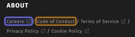
The “About” element as seen on the front end. An external link is outlined with purple. It includes the “External link” icon. An internal link is highlighted in yellow.
Who are we?
The “Who are we?” element is where you can add your social media links to the footer. Click the “Edit” button to change the element title and to add your socials.
Update the title by replacing the text in the “Title” field. This will update the text on the front end, although the element name will remain the same in the back office.
To add a new social media profile, click the “Add link” button below the “Title” field. A dropdown and text field will appear.
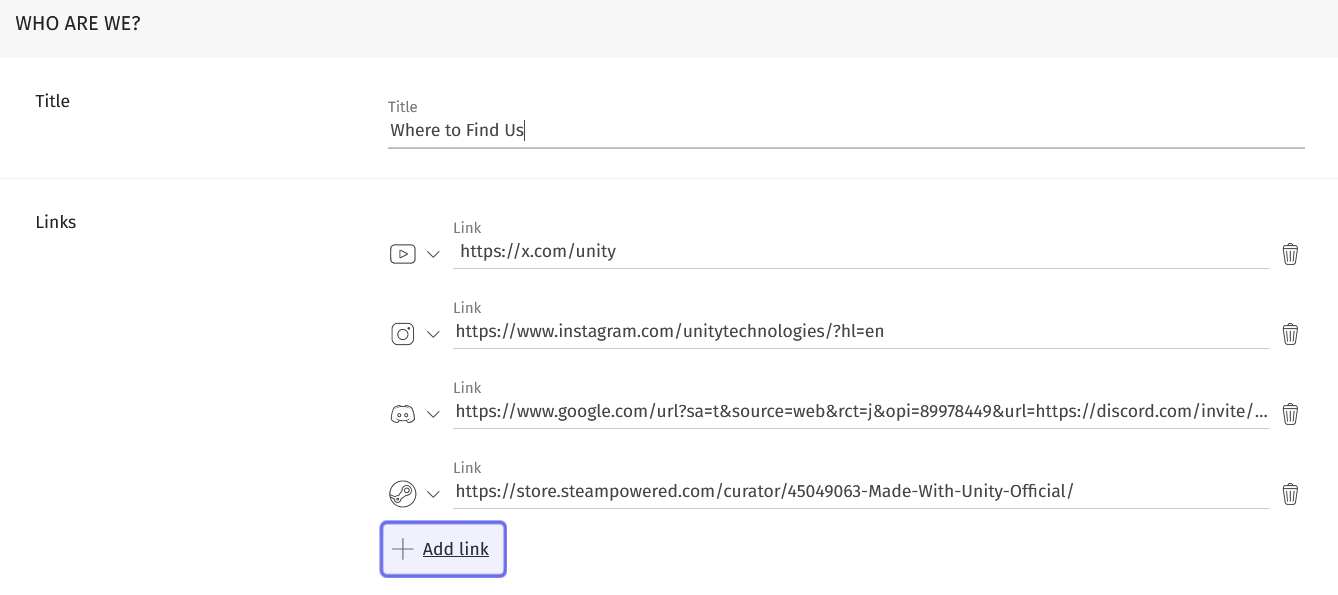
The customizable fields of the “Who Are We?” element is shown above.
The “Add link” button is highlighted in purple.
Select the logo of the social media platform you want to link to from the dropdown on the left. You can add links for the following platforms:
Facebook
Youtube
Twitter/X
Discord
Steam
Twitch
Instagram
TikTok
Threads
Bluesky
Next, add the URL that directs to your profile on that platform in the field labeled “Link.”
Note: If you need to remove a social profile, or have added one in error, you can delete a URL by clicking on the trashcan icon to the right of the “Link” field.
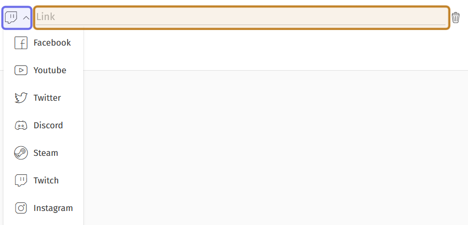
The fields to add a new social link to the “Who Are We?” element are shown above. The dropdown to select a social platform is highlighted in purple. The dropdown is shown expanded. The field to add the link to the associated social profile is highlighted in yellow.
Keep in Touch
The “Keep in Touch” element is where you can add a customized call-to-action (CTA) button. Click the “Edit” button to add your CTA.
Customize the title for the element by replacing the text in the “Title” field. (This does not change how the element is identified in the back office.)
Next, add your short call-to-action in the “Call to action label” field. The text you enter here will appear on a button on the front end. The “Keep in Touch” element is intended to encourage users to sign up for a newsletter, but it can be used for any CTA linked to a URL.
Note: If you want a call-to-action that leads to your store, you may want to use the “Store” element instead.
Then, add the link you want the button to direct to in the “Call to action link” field.
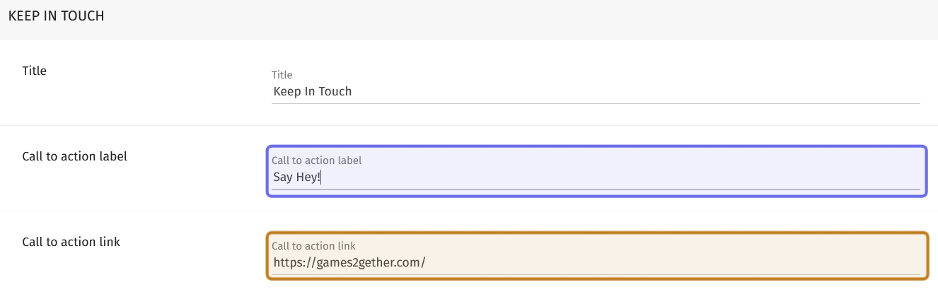
The customizable “Keep in Touch” fields are shown above. The field for the CTA button label is highlighted in purple. The field for the CTA link is highlighted in yellow.
Store
The “Store” element is intended to link to an online shop or your studio’s page on a distribution platform. However, it operates the same as the “Keep in Touch” CTA element and can be used for any suitable CTA.
Click the “Edit” button and customize the fields mentioned above to add a link that calls the user to purchase a product or your preferred call-to-action.
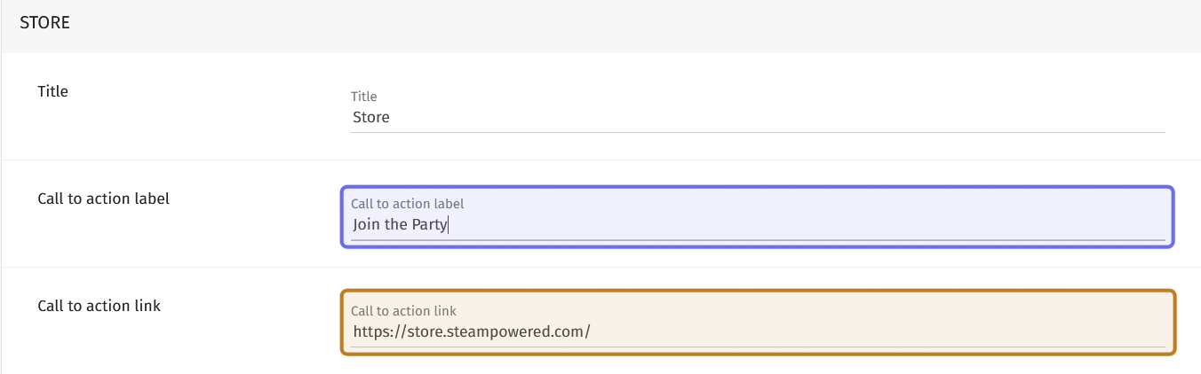
The customizable “Store” fields are shown above. The field for the CTA button label is highlighted in purple. The field for the URL where the CTA can be carried out is highlighted in yellow.
Save Your Changes
Once you have customized the footer, don’t forget to save your changes! You can find the “Save” button in the page header on the right. It is across from the “Footer” page title on the right side of the page.
The “Footer” settings page is shown above with the “Save” button highlighted in yellow.